Introduction
Have you ever printed a photo only to find the colors look nothing like what you saw on your screen? Maybe the blues are too purple, the reds are too orange, or the skin tones are just… off. This frustrating disconnect happens more often than people realize, and the reason comes down to one key concept: color management. At the heart of color management are ICC profiles and color calibration. When used properly, these tools ensure that your prints reflect your vision with stunning accuracy.
What Are ICC Profiles?
ICC (International Color Consortium) profiles are digital “translation guides” that describe how colors should appear on a specific device—whether it’s your monitor, printer, or even a specific paper type. Every device sees and reproduces color slightly differently, and ICC profiles help standardize the color experience across them.
For example, a vibrant sunset photo might look perfect on your laptop but appear dull or overly warm when printed—unless your workflow uses the correct ICC profiles. These profiles help your printer interpret the image file correctly and translate the colors to match your intended look.

What Is Color Calibration?
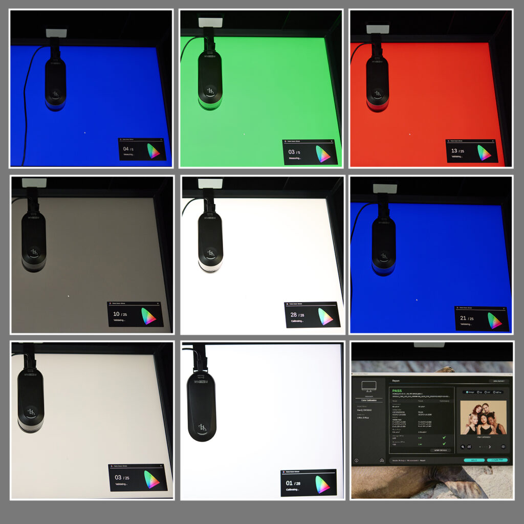
Color calibration is the process of adjusting your monitor or printer so that it displays colors as accurately as possible. Most screens are too bright, contrasty, or saturated right out of the box. Calibration corrects these issues by setting a consistent baseline, which is essential for editing photos with confidence.
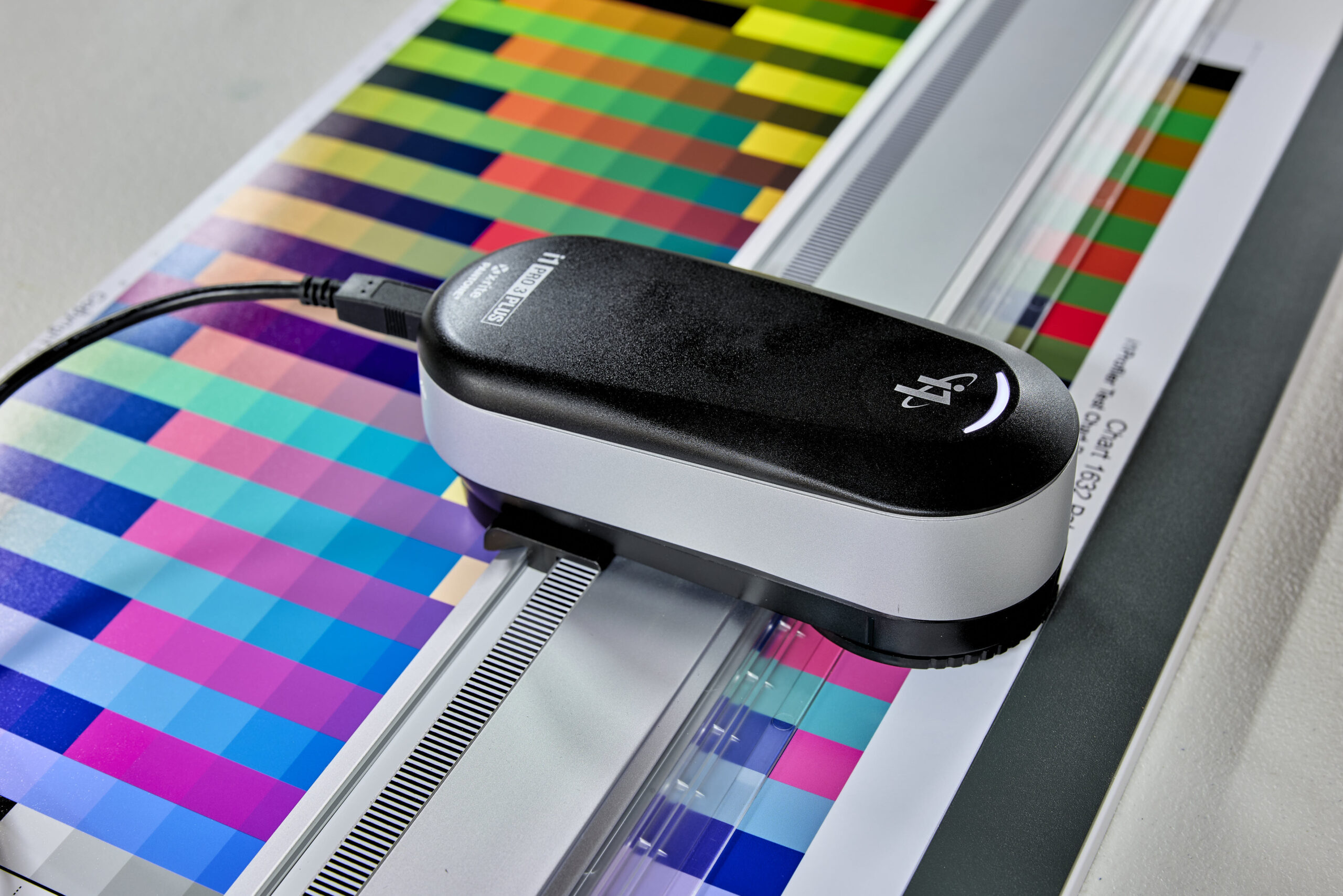
At Photographic Solutions Visual Arts, I use a BenQ SW321C monitor, which supports hardware calibration for incredible accuracy. For color calibration, I rely on the i1Publish Pro 3 Plus from X-Rite—an industry-leading tool that ensures both my display and printer are perfectly profiled and aligned.
Why It All Matters for Printing
Without accurate calibration and ICC profiles, your prints are left to chance. What looks right on screen might come out completely wrong on paper. This is particularly critical for professionals—photographers, artists, and designers—who need their work to be seen and appreciated exactly as intended.
My goal is simple: to take the guesswork out of printing so that you receive artwork that looks just as you imagined it—or better. It’s about trust, quality, and delivering results that reflect your creative vision.
Final Thoughts
Color management might sound technical, but it’s the foundation of great printing. You shouldn’t have to worry about whether your images will print correctly—leave that to someone who lives and breathes this stuff.
If you’ve ever been disappointed by a print, let’s fix that. Reach out, ask questions, and bring your vision to life with precision and care. At Photographic Solutions Visual Arts, your color is in good hands.
