Author: Albert
-
What Is DPI in Printing—and Why Does It Matter?
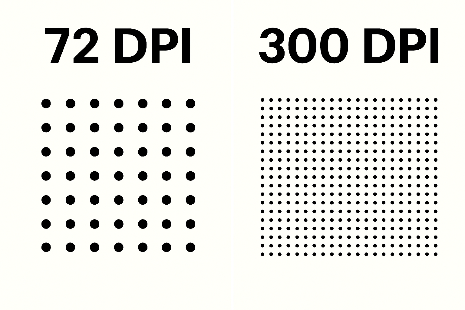
When it comes to printing photos, artwork, or marketing materials, DPI (Dots Per Inch) is a key factor in how sharp and detailed your final print will appear. What Is DPI? DPI refers to how many ink dots a printer places within a single inch. More dots mean more detail and smoother tonal transitions. 300… Read more
-
PPI (Pixels Per Inch): Why It Matters in Digital Imaging and Printing
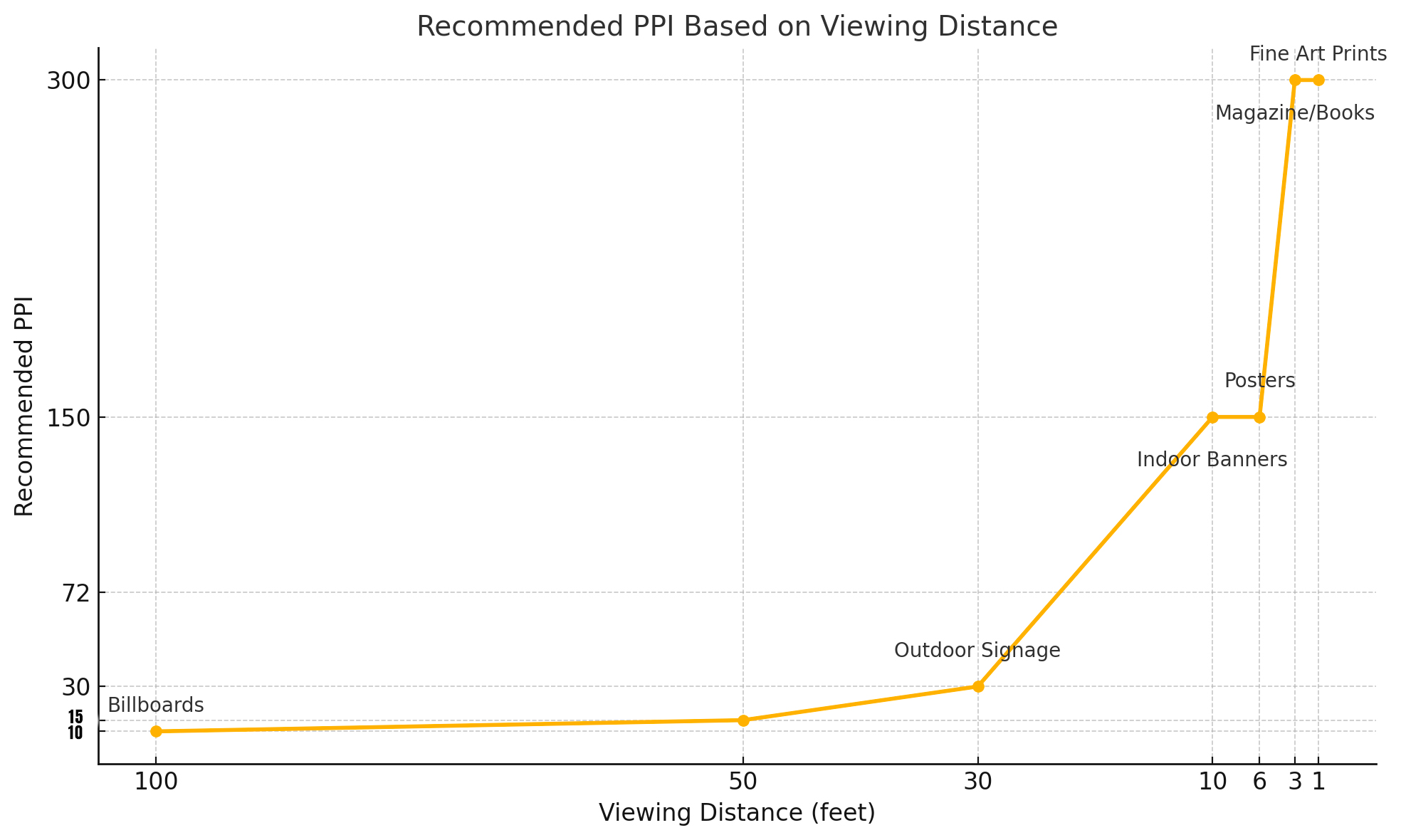
PPI (Pixels Per Inch) defines how many pixels are packed into each inch of an image. It directly impacts clarity and print quality. Choosing the right PPI is essential for achieving professional-grade results in printing and digital imaging. What Is PPI? PPI measures how many pixels appear in every inch of a digital image when… Read more
-
The File That Prints Best: Fact Guide from Capture to Output
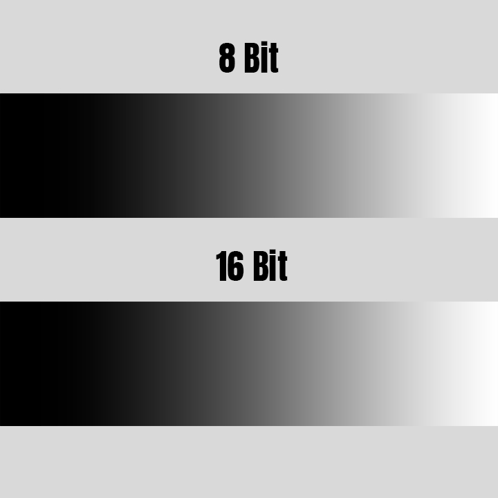
When it comes to creating a professional-quality print, your image file is everything. Size, format, and bit depth directly affect the sharpness, color fidelity, and tonal smoothness of the final product. This guide will walk you through the non-negotiable best practices for delivering optimal files — from capture to the final exported version — so… Read more
-
Understanding CMYK: How Printers Bring Color to Life
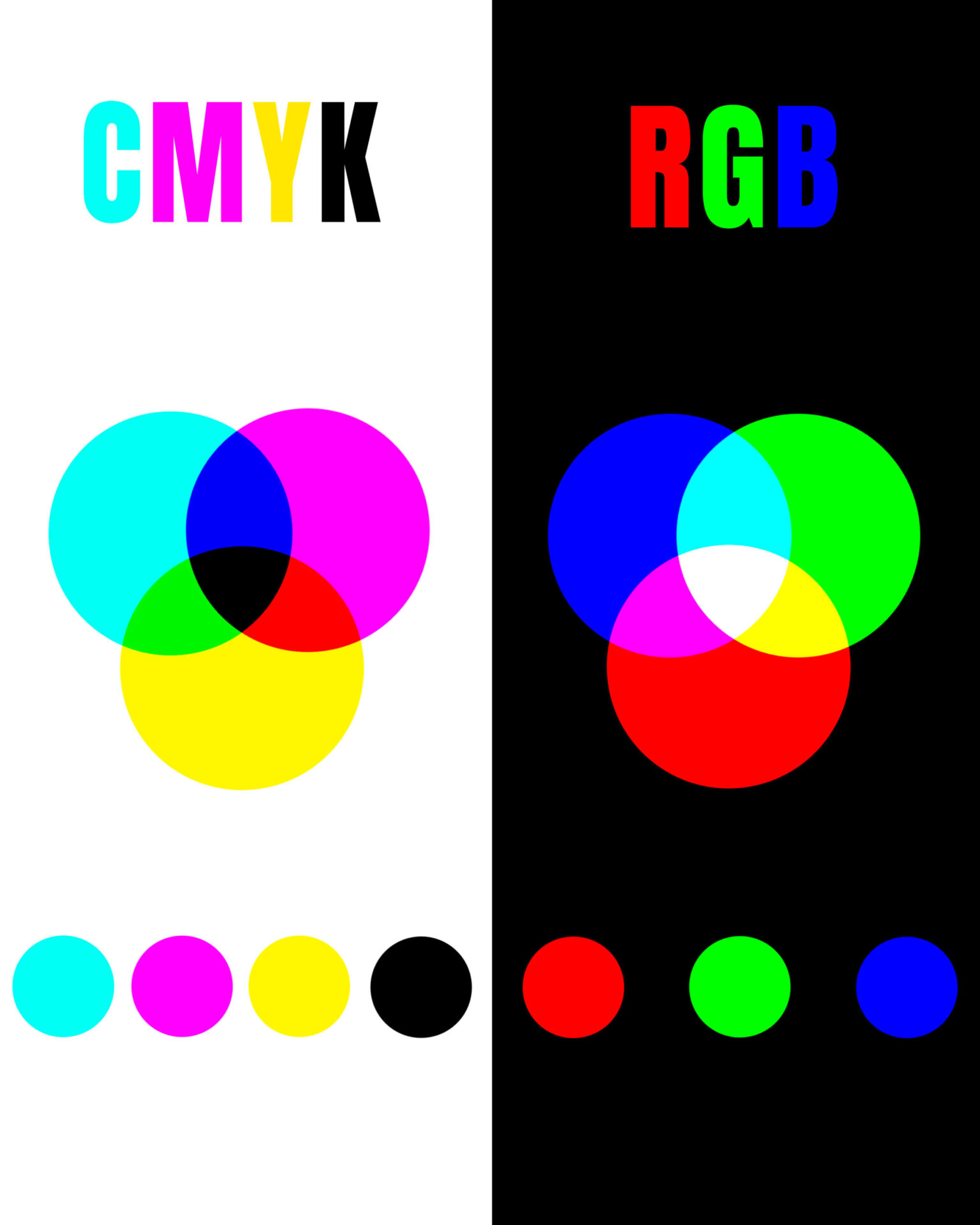
Introduction When you hit “print,” you’re unleashing a carefully orchestrated dance of color but what happens behind the scenes? Unlike your monitor, which displays colors in RGB (Red, Green, Blue), professional printers use a different language: CMYK, Cyan, Magenta, Yellow, and Key (Black). Understanding how CMYK works can help you make better decisions about file… Read more
-
Through the Editor’s Eye: Understanding Vision and Preventing Eye Strain

Introduction Photo editing is a meticulous craft — one that demands focus, precision, and hours in front of a glowing screen. But behind every carefully adjusted highlight and color curve is a hardworking, often-overlooked tool: your eyes. Understanding how the human eye processes light and color can reveal why editing can be so visually fatiguing… Read more
-
Understanding Color Space: Getting It Right on Your Monitor
When it comes to photo editing and printing, few things are more important — and more misunderstood — than color space. If you’ve ever edited an image that looked vibrant on your screen but printed dull, or uploaded a photo to the web only to see it lose punch, the culprit was likely a mismatch… Read more
-
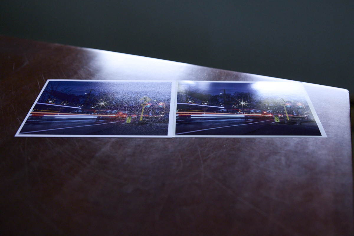
The Fine Art of Giclée: Why Paper Matters in Archival Printing
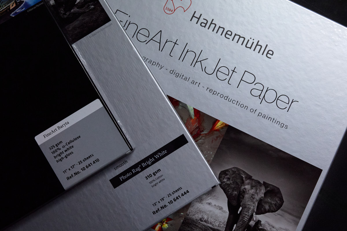
Introduction While both paper choice and giclée printing are deeply connected in the world of fine art and photography, I felt it was important to keep them as separate topics. Choosing the right paper focuses more on the aesthetic qualities — how texture, finish, and tone impact the final image — whereas discussing giclée printing… Read more
-
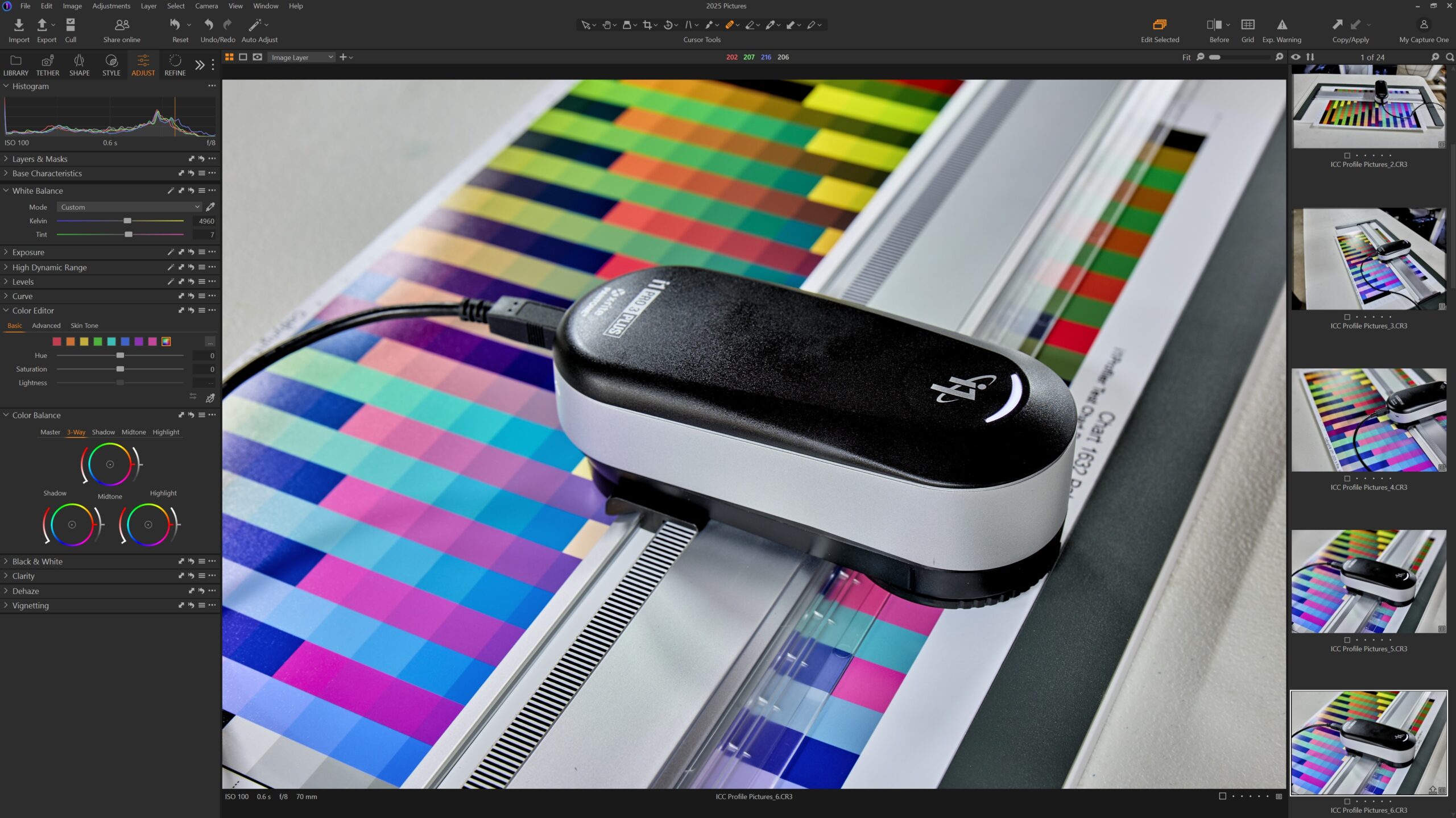
Why ICC Profiles and Color Calibration Are Essential for Perfect Prints
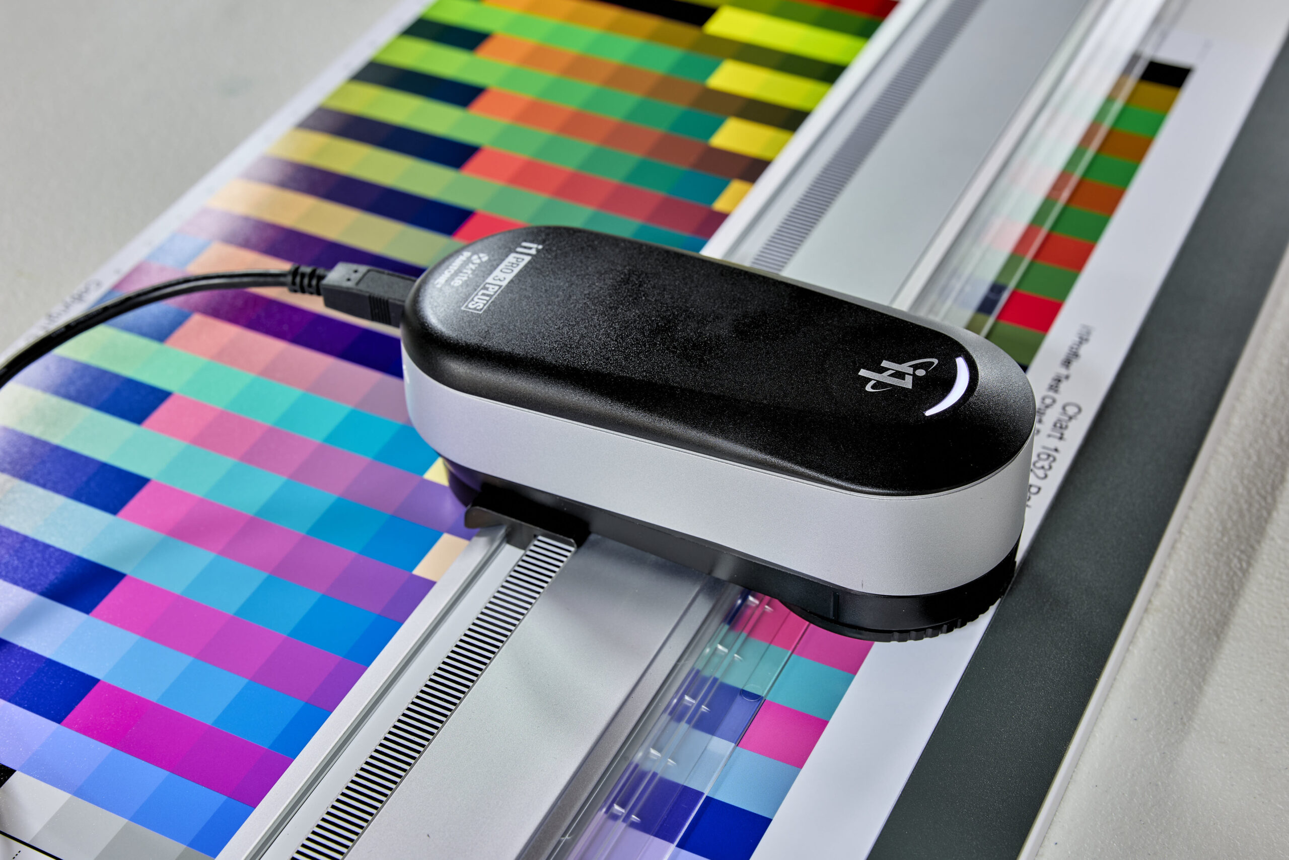
IntroductionHave you ever printed a photo only to find the colors look nothing like what you saw on your screen? Maybe the blues are too purple, the reds are too orange, or the skin tones are just… off. This frustrating disconnect happens more often than people realize, and the reason comes down to one key… Read more
-
Help choosing the right paper for you.
Choosing the right photo paper is just as important as capturing the perfect shot. Different finishes impact how colors, details, and textures appear in a print. Whether you want the bold vibrancy of metallic, the balanced sheen of luster, the classic shine of glossy, or the soft elegance of matte, each paper type brings its… Read more
-
How Photo Enhancement Can Transform Your Memories
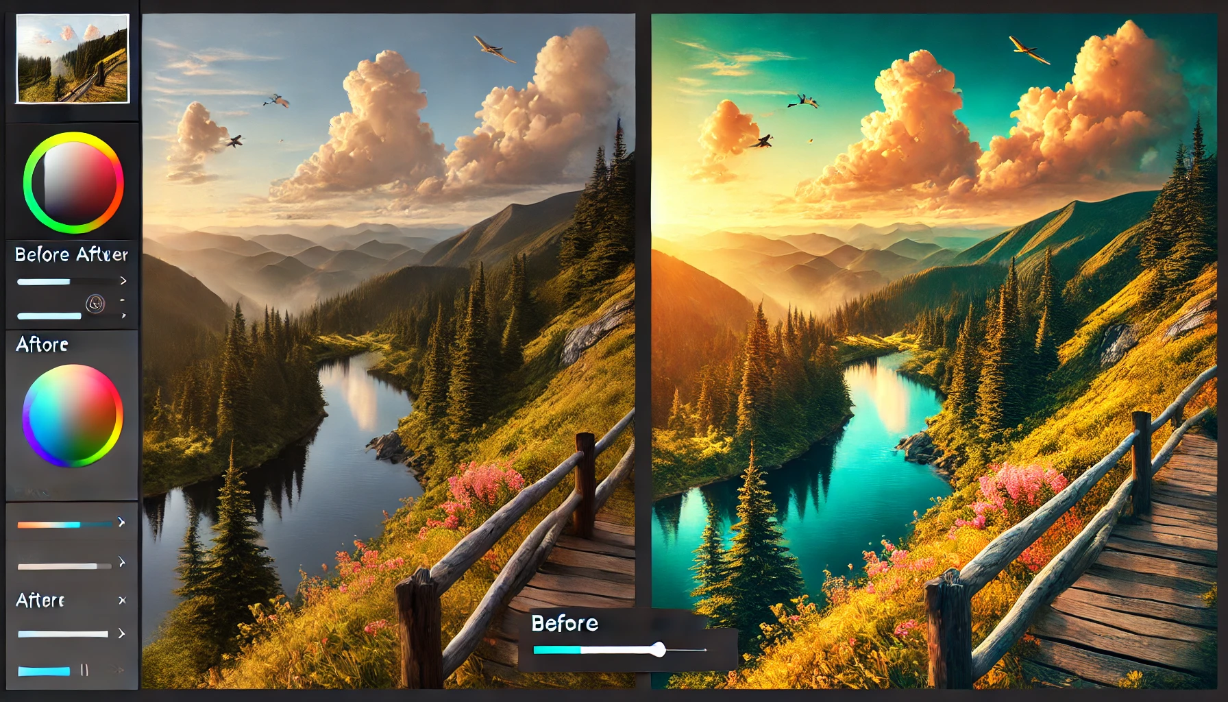
Our photos capture moments in time, but sometimes they need a little extra touch to truly shine. Whether you have cherished family portraits, a professional headshot, or images you want to showcase on your website, photo enhancement can make all the difference. At our studio, we offer a range of services designed to breathe new… Read more
