
Introduction
While both paper choice and giclée printing are deeply connected in the world of fine art and photography, I felt it was important to keep them as separate topics. Choosing the right paper focuses more on the aesthetic qualities — how texture, finish, and tone impact the final image — whereas discussing giclée printing dives into the technical craftsmanship behind creating museum-quality prints. By treating them individually, I can give each subject the attention it deserves, helping readers first understand the creative decisions around paper selection, and then appreciating the precision and archival standards that true giclée printing upholds.
When it comes to showcasing artwork or photography in its truest form, not all prints are created equal.
Giclée printing, often considered the gold standard for fine art reproduction, is a process that combines
archival pigment inks with high-end inkjet technology to produce stunning, museum-quality prints. But even
the best printers and inks can’t do the job alone—fine art paper plays a crucial role in bringing a print to life.
What Is Giclée Printing?
Giclée (pronounced ‘zhee-clay’) is a French term meaning ‘to spray,’ referring to how ink is applied during the
printing process. Unlike standard prints, giclée prints are created using pigment-based inks on archival
substrates. This method allows for exceptionally fine detail, a wide color gamut, and longevity that rivals
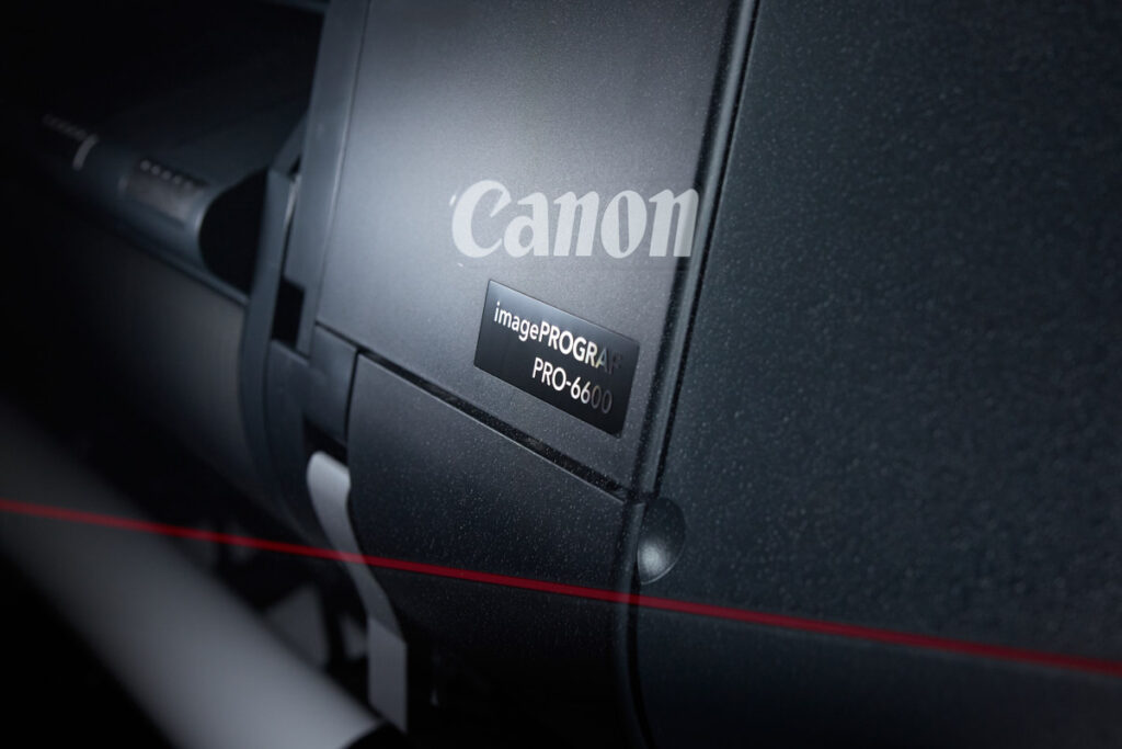
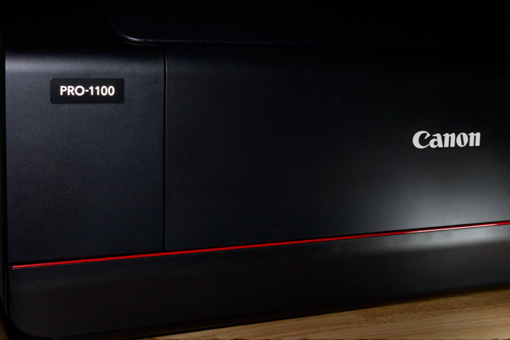
traditional darkroom techniques. At Photographic Solutions Visual Arts, I use professional-grade
equipment—including the Canon Pro 1100 and Canon Pro 6600—to ensure each print is as vibrant, accurate,
and lasting as the original vision.
The Importance of Fine Art Paper
The paper used in a giclée print isn’t just a surface—it’s a partner in the process. Fine art papers are typically
made from 100% cotton rag or alpha-cellulose and are both acid- and lignin-free to ensure longevity. Texture,
weight, and tone all influence how the ink interacts with the surface. A textured paper can add depth to
painterly images, while a smooth matte might be better for sharp details and subtle tonal transitions.
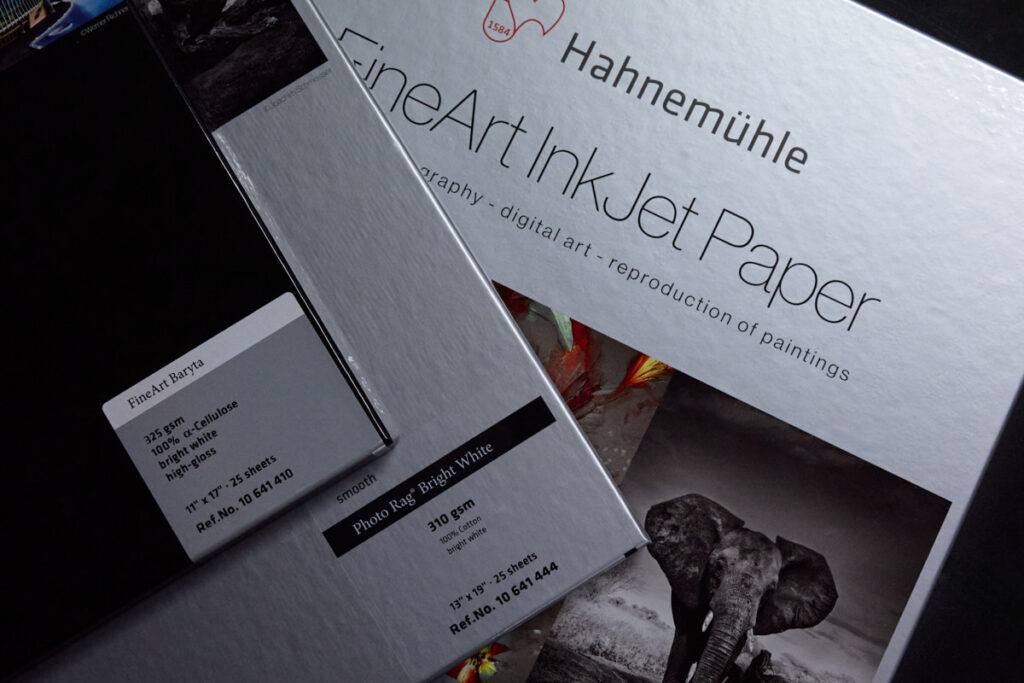
My Go-To Fine Art Papers
Each paper I use offers something unique. Here are a few of my trusted favorites:
– Hahnemühle Photo Rag: Smooth, soft cotton feel. Perfect for photography with subtle gradients and soft
tones.
– Canson Infinity Aquarelle Rag: Beautiful texture that mimics traditional watercolor paper—ideal for
illustrations and artwork.
– Moab Entrada Rag: A bright white, versatile paper with excellent color and contrast—great for bold visuals
and black-and-white imagery.
Longevity and Archival Value
Giclée prints on fine art paper aren’t just beautiful—they’re built to last. Many combinations of archival inks and
museum-grade paper can last over 100 years with proper care. All papers I use meet or exceed ISO 9706
standards for permanence and are tested by institutions like Wilhelm Imaging Research.
Color Accuracy with Custom Profiling
To ensure color precision from screen to paper, I create custom ICC profiles using the i1 Publish Pro 3 Plus.
This allows me to match your image’s color, contrast, and tone—exactly as you intended it. No guesswork. No
surprises. Just beautiful, true-to-life prints.
Why It Matters
For photographers, artists, and collectors, investing in fine art giclée prints is about more than quality—it’s
about integrity. A well-made print tells a story, honors the original work, and adds value to the final product.
Final Thoughts
Printing is not just a technical step—it’s a craft. When you choose giclée printing with fine art paper, you’re
choosing to respect your art, your vision, and the people who will experience it.
At Photographic Solutions Visual Arts, every print is treated as a work of art—because that’s exactly what it is.
Interested in seeing your work on fine art paper? Let’s talk about which options best fit your image and your
goals. Contact me or visit my print consultation page to learn more.
