When it comes to photo editing and printing, few things are more important — and more misunderstood — than color space. If you’ve ever edited an image that looked vibrant on your screen but printed dull, or uploaded a photo to the web only to see it lose punch, the culprit was likely a mismatch in color space.
In this post, we’ll break down what color space is, why it matters when working on a monitor, and how to get your color workflow under control — especially if your end goal is high-quality printing.
What Is Color Space?
Color space refers to the specific range of colors (or gamut) a device or file can represent. The three most common color spaces you’ll encounter in photography and digital art are:
– sRGB – the standard for web and most screens. It has a relatively small gamut, but it’s universally compatible.
– Adobe RGB – a wider gamut, especially in greens and blues. Ideal for photo editing and printing when used with color-managed workflows.
– ProPhoto RGB – an extremely wide gamut used in high-end retouching and printing, but requires caution due to potential for color clipping and banding in non-compatible software.
Think of color space like a box of crayons. sRGB is your 24-pack, Adobe RGB is a 64-pack, and ProPhoto RGB is a 120-pack — but you can’t use the bigger sets effectively unless your monitor and software can interpret them correctly.
Monitor Calibration and ICC Profiles
Even if you’re using a high-end monitor, your colors won’t be accurate without calibration.
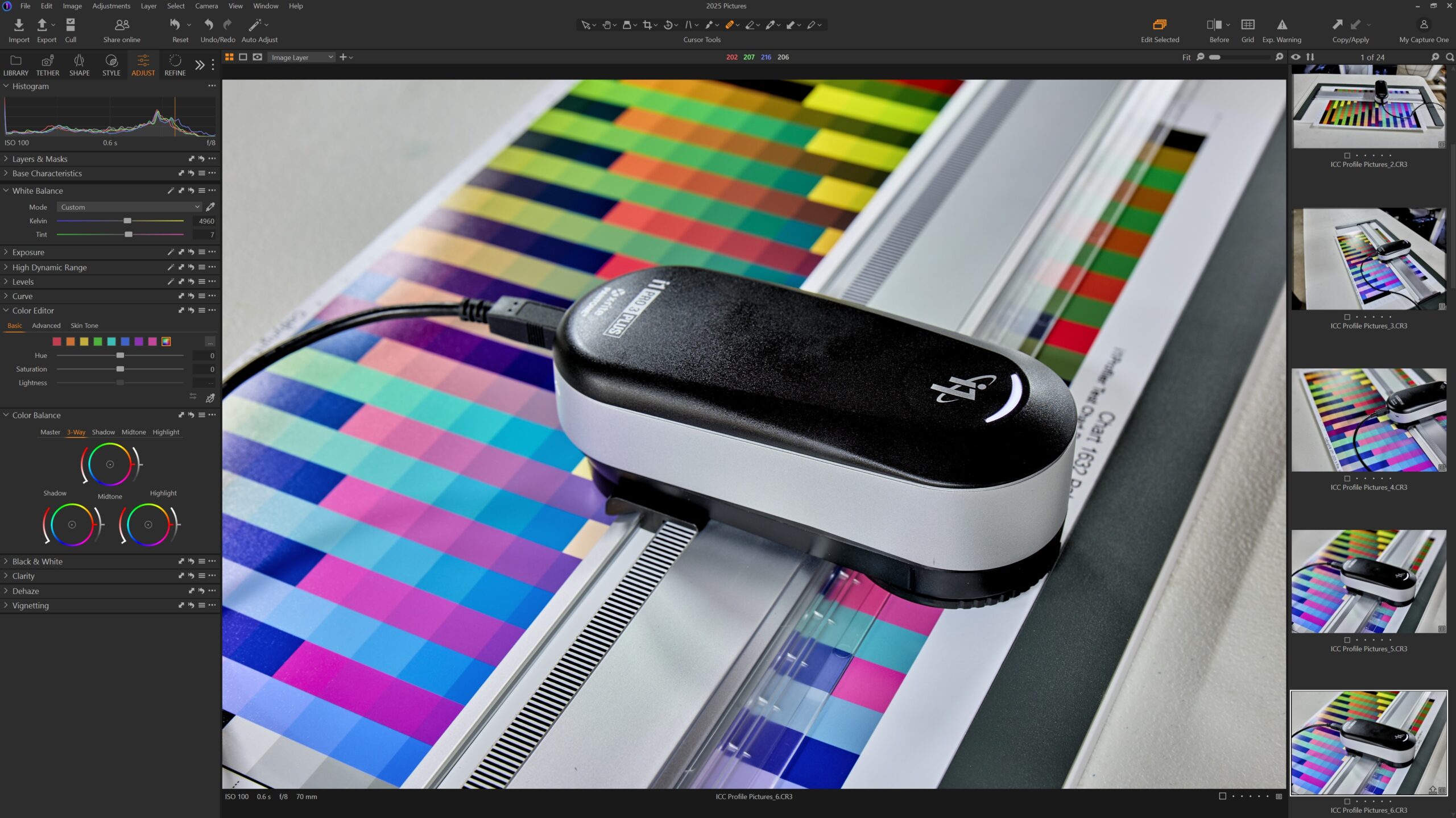
I use a BenQ SW321C, which supports 99% Adobe RGB and hardware calibration. To keep it accurate, I use the i1 Publish Pro 3 Plus, which lets me create a custom ICC profile that maps how my monitor displays colors and corrects it accordingly.
This matters because every monitor is slightly different. Without a calibrated profile, what you see on your screen might not reflect the actual values in your file — and that can lead to disappointing prints.
Ambient lighting also plays a role. Editing in a room with changing light can shift how colors appear, so using consistent, neutral lighting (like 5000K daylight bulbs) helps maintain color accuracy.
Choosing the Right Color Space for Your Workflow
Different outputs call for different color spaces:
– sRGB: Best for anything going online — websites, social media, email, etc. It’s the most widely supported and ensures colors stay consistent across all devices.
– Adobe RGB: Ideal for photo printing and gallery-level work. Make sure your entire workflow — from camera to monitor to printer — supports Adobe RGB.
– ProPhoto RGB: Useful for advanced retouchers who need the broadest gamut during editing. But always convert to a printable space (like Adobe RGB or a printer ICC profile) before exporting.
Common Mistakes to Avoid
1. Editing in one color space, exporting in another: This leads to color shifts and print mismatches. Know your destination and stick with a consistent space throughout.
2. Uploading Adobe RGB files to the web: Browsers and social platforms default to sRGB. Uploading Adobe RGB images can make your photos appear dull and desaturated online.
3. Skipping soft proofing: Before sending a file to print, soft proof using your paper’s ICC profile. This simulates how colors will look on a specific paper, helping you make adjustments ahead of time.
Best Practices for Accurate Color
– Calibrate your monitor every 2–4 weeks.
– Work in a color-managed environment (Capture One, Photoshop, Lightroom).
– Soft proof your images using ICC profiles specific to your paper and printer.
– Avoid editing in ProPhoto RGB unless you’re confident your tools support it properly.
– Use consistent, neutral lighting in your workspace.
Final Thoughts
Color space isn’t just a technical checkbox — it’s a crucial part of creating images that look the way you intended. By choosing the right color space, calibrating your monitor, and using color-managed software, you can ensure that your prints match what you see on screen.
Whether you’re a photographer, artist, or visual storyteller, understanding color space gives you control over your final product — and keeps your vision consistent from capture to display to print.
